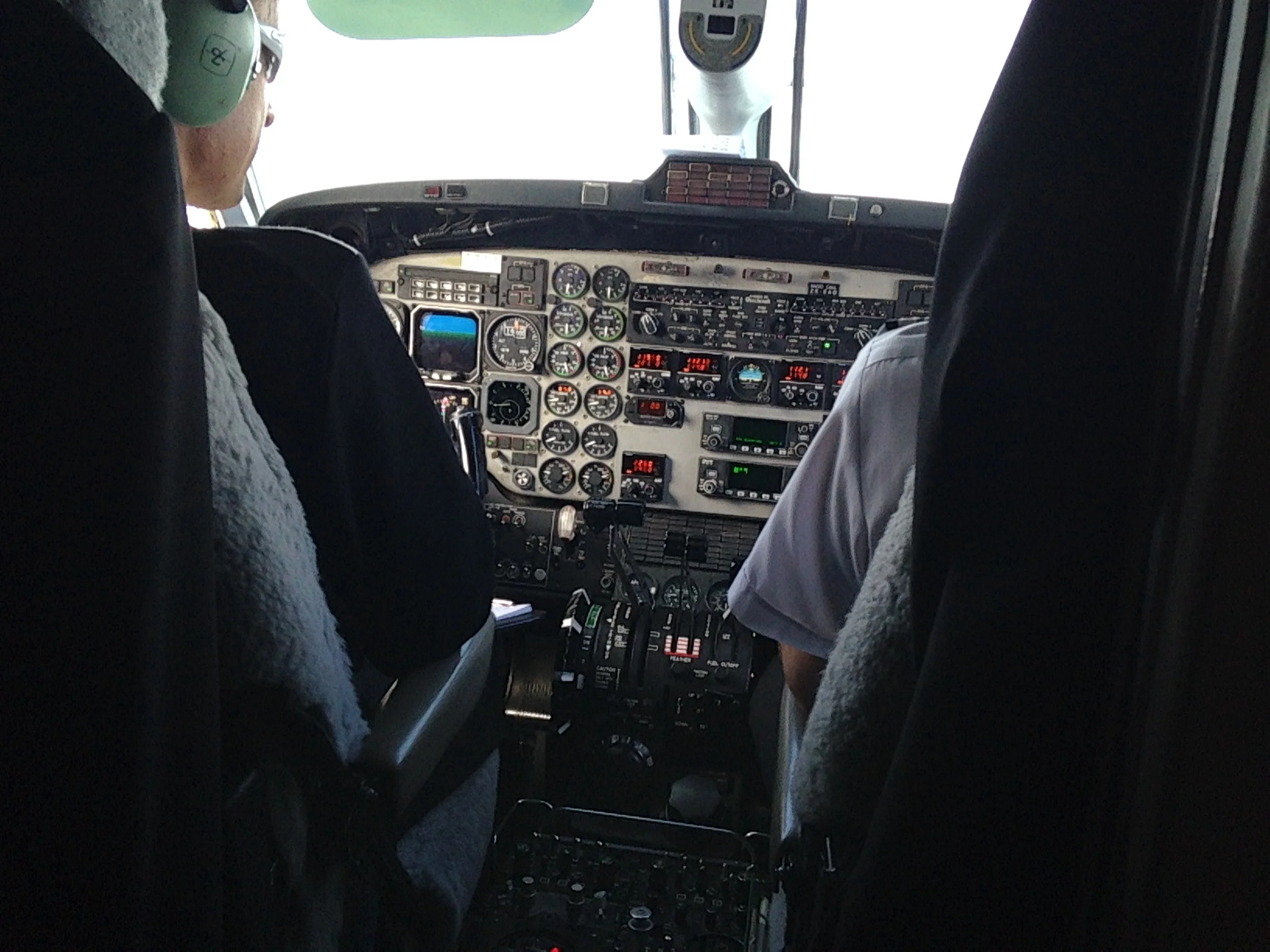
Beechcraft 1900D Cockpit
I had the pleasure of travelling around the spectacular Bay of Plenty region in New Zealand last week, developing 2024 workforce strategy with some incredible people. The hop from Auckland to Rotorua was on a Beechcraft 1900D, and I was fortunate enough to be in 1F - the seat that gives you the best of the cockpit, which gave me pause for thought about workforce analytics dashboard design. Although I usually advocate for a "less is more" approach to analytics in dashboards, the dashboard of an aircraft is fascinating - every gauge, every dial serves a purpose and provides real-time, actionable data. Many business analytics dashboards don't exhibit these properties. A good rule of thumb when determining whether workforce analytics should be reported is to ask these three questions:
- What?: What information is this display giving us? Does it make sense, and can its purpose be clearly communicated?
- So What?: Why does this information matter - what is it's connection to organisational strategy? What's the context as to why we are reporting this?; and
- Now What?: Is the data actionable, and if so, how?
If you're unable to answer these three questions, it may be time to take your dashboard back to the drawing board.


